Tutor’s feedback of Part One and my response
In response to my tutor’s comments I’m pleased that the artistic direction in going in positive, as I do feel that it’s completely my style, and it’s great to be able to unleash it and take it further.
Underpinning my work with more research, reading and quotes is something that I am embracing more on a regular basis, and I’m enjoying having more depth of knowledge as a result. Personally, I’m a visual learner, so reading lots of text is difficult for me, so I’m trying to balance this format with watching documentaries so it’s all more digestible. For example, I watched Andrew Marr’s ‘History of the World’ DVD, and this has really helped me understand how the world is shaped – global, social, cultural and political reasons often indicated in art. For example, the show briefly touches on the life of Da Vinci and how he was asked to paint the Last Supper as a ‘show stopper’ by the Duke Ludovico Sforza for the refectory of the monastery of the Dominican monastery Santa Maria delle Grazie near Milan. Leonardo spent three years painting the mural, but much of the time was spent searching the streets of Milan for models of Christ and Judas. He created a true feel of perspective and 3D in his work – it actually felt like part of the room.
I have started to watch a DVD called ‘Art in Germany’, and actually really enjoy watching and listening to how the presenter, Andrew Graham-Dixon talks about art – it’s very inspiring as he’s so passionate about it, especially when he is discussing with curators certain pieces of art.
Additionally, I’m finding that I’m comparing other artist’s work more comprehensively, and finding inspiration and links with my work work and practice. This is extremely useful for further my ideas!
I have gone back to Part One and added more in-depth detail, quotes and images as requested.
Current and to do reading / watching list:
– Drawing People by Roger Malbert
– Vitamin D2 New Perspectives in Drawing (Phaidon)
– Learning to Look at Paintings by Mary Acton
– DVDs Art in Germany and Art in America, bith presented by Andrew Graham-Dixon.
– History of the World, DVD by Andrew Marr
– TV series (currently on ITV) Great Art
I have also watched and read these OCA short blog posts to support my studies, as suggested by my tutor, see below. I found all of them very inspirational and positive! No doubt I will return to them from time to time…
https://weareoca.com/students/student-work/drawing-erratic-drawing-one-success-story/
https://weareoca.com/subject/fine-art/using-an-eraser/
https://weareoca.com/subject/fine-art/forget-inspiration-get-on-with-the-work/
https://weareoca.com/subject/fine-art/steal-like-an-artist/
**Please note: Some drawings have masking tape around them – this is just a way of keeping a clean border, and can be removed for any formal assessments in the future. Due to the textural nature of my work it can be a bit dusty I’m afraid, even though I have fixed them. **
Download tutor feedback for Part One
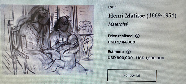
Matisse’s pentimento approach
My tutor has asked me to look at Matisse’s pentimento work, as this style of built up lines contributes to a complex overall piece. Evidence of previous drawings within the work help show ideas – especially that the art has not been made instantly – it shows the labour behind the work. I also see it as a way of illustrating time, passing moments and thoughts, so I think this technique fits in well with my current project ideas.
Russian born painter, Sanya Kantarovsky, descibes the Italian word “pentimenti to refer to the traces of previous decisions visible beneath the surface of a finished painting. The word’s original meaning, “repentances,” casts this residue of making in moral terms: the artist’s remorse for a “wrong” precipitates a correction to a “right.” taken from her musings on this technique, online and in Art America Magazine:
https://www.artinamericamagazine.com/author/sanya-kantarovsky/
I have chosen this statement, as I think she’s spot on. In fact, really there’s very few things that humans do that they truely believe to be ‘wrong’ – and if by doing wrong in other’s eyes, it’s usually that persons attempt to make things right, either for their own selves or for others. So, again doing wrong is really an opportunity to progress, and by drawing or filming ours wrongs we are showing the passing of time as we practise to improve. I will happily watch snip-its of people falling over or off their skateboards on TV, and these moments are often much more interesting than the final moves!
It’s quite brave for an artist, or anyone. to display their ‘mistakes’, but the show of practise and willingness can go a long way.
A fine example of Matisse’s pintimento can be seen below, ‘Maternite 1939’.
Other web visits:
https://www.christies.com/lotfinder/Lot/henri-matisse-1869-1954-maternite-4807459-details.aspx
https://spaceforthejourney.blog/2018/01/02/pentimento/
https://en.wikipedia.org/wiki/Pentimento
Project One: Space, depth and volume
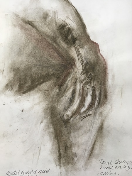
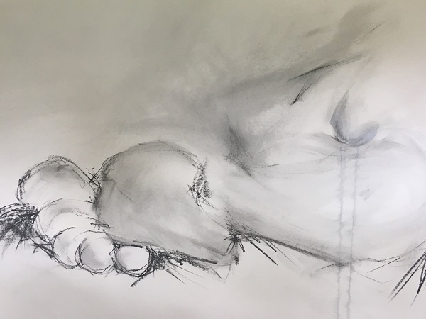
This section of Part Two, asks me to look at subjects without an outline, suggesting a technique of working from a dark pastel coverage to light, omitting the dark by using erasers. I think this experiment is vital for me, as I do use outlines a lot first, and then try to add tone and gradients afterwards – but the outline is always so prominent and confident. For me, the outline is the first thing I see that differentiates the subject from it’s environment – like a barrier. So my instinct is to start bold and strong with thick lines. I hadn’t thought about different ways of creating this ‘outline’, so I feel quite excited about experimenting!
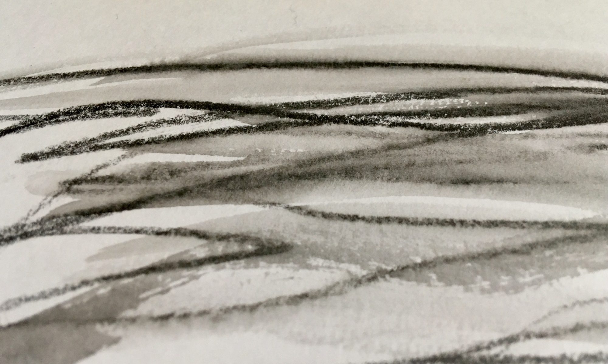
I started by using the technique suggested – the pastel with removal via erasers. The whole process made me think about Renaissance chiaroscuro art. Dramatic lit figures would emerge from dark tones to create drama but also diffuse outlines edges. It seems to allow the audience a chance to decipher the image for themselves rather than a line being physically drawn for us.
Below shows pre-prep drawings, using the usual outer lines…
I enjoyed this technique and can see the difference in what felt like ‘working backwards’ (from dark to light). It felt quite constrained in places, as the eraser would only collect so much pastel from the paper – and I would have liked to have seen more white (but this is me simply breaking out of my my comfort zone!)
I chose to use ochre pastel blocks, as I wanted to retain an earthy landscape feel to the composition of the body, and I think it does what I wanted, however having more white or perhaps more dark would give it a greater tonal range and more ommph.
I looked at a couple of other compositions, using different colours, but based on the same technique….
The above experimental piece, was an attempt to manipulate the contrasting areas further into their extremities, but the lines are too harsh and tend to dominate.
I tried again, this time working in charcoal, see below, a graphite drawing and it’s tonal variant. I like both – the scratchy linear raw feel of the body in drawn graphite gives a sense of new and movement – but it is struggles to deliver on 3D effect. However the buffed, soft other version is more romantic and sculptural – meaning it shows good structure and form. I love how this offers a sense of depth and form, but I hate how it looses it’s identity in the way I perceive it as an artist.
Lastly, I tried ‘ArtGraff’, which a friend let me borrow. It looks a bit like tailor’s chalk (of various colours), and has much the same smooth feel about it. To work with it has a strong feel of using stone or flint – very elementary or basic, and this I really enjoyed. Here are my attempts, one without water wash and one with:


Research Point: Angela Eames
Angela Eames’ work is quite mesmerising. Her patterns of ‘Sand’, and slow metamorphosis of change in ‘Cycle’ (see image below) draws the eye in and she makes the viewer wait patiently for change in the series, giving the ‘middle ground’ real presence and stature that it’s just as important as the start and ending. ‘Cycle’ takes 20 mins to adapt from thin cracks into larger lines – the whole images changes from a vision of dry land to the night sky through silhouetted trees. It’s the change and the residue that Eame’s wants to showcase here – the stuff that usually gets ignored or washed down the drain.
This quote taken from her website, https://www.angelaeames.com/ sums up her ideas behind her work.
“Too much gloss – too much fine-tuning – too much surface – too much superficial sheen – too much polish. Not enough blemish – not enough imperfection – not enough foible – not enough fallibility – not enough spit. Masses of potential – loads of opportunities – plentiful solutions – permutations galore but not enough risk… and not enough spit. “

It’s interesting that Eames has found art in the fragments of life that get overlooked or ignored, because of it’s grimess. This not-so-glamorous matter is created and presented in a very polished way – every things so very neat and, I feel demonstrates that even this “spit” or “blemish” can become a piece of ‘perfection’. She uses video, computers and photography a lot – I presumed this is because it can be manipulated so easily and demonstrates the “polished” clinical aspect, but actually she became interested in using computers during her study work. Overall it contemplates it’s polar opposites, and she often showcases the middle processes too.
Following further research, Eames was brought up in Bahrain, Asia, so was introduced to the patterns of Islamic tiling. These patterns along with a love of drawing helped Eames focus on order and systems. This is heavily apparent in her printed pieces titled ‘Armistice’ 2015, see below both red and blue versions, which see’s a mosaic with small differences that visually throws the whole piece from agitated movement into a negotiation of lasting peace and within the square. This whole process reminds of life itself: our span of experiences and routines along with our friendships and enemies, and how we move on from disasters. It’s like a sequence. I particularly notice how the optical illusion creates a feeling of movement and 3D, but is completely flat. This is brought about by clever use of colour, sequencing and pattern.
It was during a laborious method of printing huge amounts of images, that she found out about using an Amiga computer to help her complete the task more efficiently – and her interest in using digital techniques has grown since.

It is the artist’s statement below which shows a change in the thought process of pattern and order – and this underpins her artistic move into the areas of life which are often overlooked. “Through system and order the disparate and unsuspected may be revealed. Mistakes are immediately apparent. I am forced to pay attention to them, to consider them, perhaps to use them, but essentially I am forced to acknowledge my own human fallibility. ” This, along with Eame’s constant feeling of not fitting in with her school’s art curriculum:
“How could I attach myself to a Painting Department when I might arbitrarily dive into three-dimensionality and equally how could I confine myself to a Sculpture Department and suddenly succumb to two dimensions”, made her feel even more empowered to seek out a place out of the system that she could fit.
The above images and interview statement can be viewed at: (https://www.interaliamag.org/interviews/spatial-manoeuvres-the-drawings-of-angela-eames/ )
Whilst I appreciate Eames’ ideas, I have very little interest in using digital media. However, her ideas have made me think about the contrast between my own rustic, organic style and marrying it with computerised lines and marks. The problem for me is the process – I enjoy the simplicity of earthy, messiness of basic materials such as charcoal, so to then use plastics, hardware and software to create art is a mental mind bomb.
My work, unlike Eammes’, uses emotional mark making lines instead of patterns and sequences. We do however share a common link of outputing ‘consequences’, so I see a mutual understanding. We both like to deliver the concept of decay, time lapse and change. Perhaps I could try sequencing my work, perhaps in panels of daily squares of emotional blasts and marks. This would ultimately resemble a pattern and a routine – how it would marry together I’m not sure – but I like the idea of order amongst the chaotic mind. It’s an idea – certainly inspired by Eammes’s structured pieces, and perhaps one I should take up.
My ideas stemmed from this:
– Creating order within unstructured mark making via presentation or digital media.
– Wall of daily emotional mark making squares – into mosaic or patterned sequence.
– Rubik’s cube of mark making squares / sequences – how do I feel today? Every cube face is it’s own art – audience participation.
– Create order and polish within unstructured mark making (maintaining emotional mark making output) via process by using computer software and hardware. Can computers show emotion? How is your computer feeling today? Create personality for your computer – can I create it’s emotion?
Research Point: Michael Borremans
On first looking online at Michael Borremans’s oil on canvas pieces, I had to double check that they were not actually sculptures as so many painting were so life like – beautifully painted with realism and proportions.
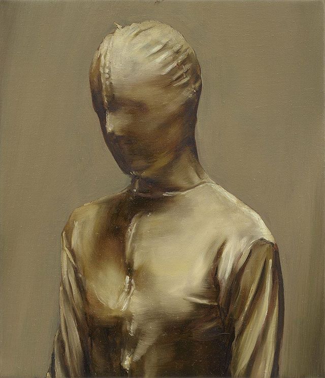
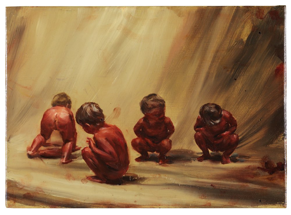
The second thing that I noticed was the removal of identity and the macabre content. In many paintings I felt that there was a real loss of choice or a removal of life – especially apparent in the paintings of ‘Amy’ for example, see below, which features a person covered in a stitched body bag type outfit. The garment removes any identification and also disables the person inside it of sight, and probably sound, touch and confidence too. There is a huge feeling of power play – and it’s very blunt. Paintings of toddlers playing with body parts or covered in blood red, titled ‘Fire From The Sun, 2017’, (see below) are stark and eerie pictures, especially when cast on a stage like background. It’s a lot to take in but strangely compelling to look at and decipher.
Sinister that it is, the way that Borremans paints, influenced by the Old Master painters such as Velasquez and Dutch genre, offers a sense of earthy elegance and structure – these are carefully considered paintings to be admired.
From the book ‘Drawing People – The Human Figure In Contemporary Art’ by Roger Malbert, Borremens is quoted as explaining his experience of the world as “..a cold and strange place. I don’t know, I find it in everything: in contact with other people, in politics, in economics, I feel like we’re living on a time bomb. I’m always surprised nothing worse happens, as if I’m anticipating it, and eventually it will happen…… when I feel uncomfortable in certain situations, I create my own reality”. I have struggled to find any history about Borreman, such as his childhood or family life, he seems to be a very private artist (as many are!)
When I compare my work and ideas with Borremans, I see a desire to communicate with the audience and draw them into our work. Borreman uses mind games and audience witness techniques with macabre images, whilst I’ve been considering more tactile ideas – such as unfolding papers to reveal images, moving squares of art to create new pieces (Rubiks cube idea) and so on. I really enjoy how he paints, although not my own style, how he uses the same colour palette for subject and background – but creates 3D effects by using strong textures and lighting against flatter plain backgrounds.
My ideas stemmed from this:
– If using colour, keep to same palette but add dimension by differing textures and tones
– Don’t be afraid to illustrate your thoughts
– Continue ideas on encapsulating the audience – but it doesn’t have to be a tactile technique, it can be a via painting or drawing
References:
‘Drawing People – The Human Figure In Contemporary Art’ by Roger Malbert
https://ocula.com/magazine/conversations/michael-borremans/
http://www.zeno-x.com/artists/MB/michael_borremans_bio.html
Research Point: Jim Shaw
I found Jim Shaw’s work a lot more sarcastic and brash – possibly because of the style as much as the content. Shaw is known for his work in American comic books, protest posters, pulp fiction and so much more. Shaw uses inspiration from his own family life to create ideas for his work, which has been rolling since the 1970s.
His first major body of work and ‘novel’ titled ‘My Mirage, 1986-91’ shows 170 images, sculptures, films and prints as a semi-autobiographical story of ‘Billy’ and his journey from child to teenager during the 1960’s and 70’s. See a section below.
According to the Simon Lee Gallery website, Shaw was once stated “that one could “understand the meaning of life through misinterpretation”; Jim Shaw’s practice seems consciously layered and complex in its effort to liberate the minds of both artist and viewer”. (see web link below) I think this is apparent in his work, especially in his more recent pieces where he created a new type of religion titled ‘Oism’, which certainly challenges people’s views.

Because Shaw’s work is so vast and changeable (I believe he uses the world’s social trends and capitalism to inspire his art) I find it hard to establish a connection with his style – other than it’s pure showmanship. I admire an artist who can manipulate their works to ‘fit in’, as it can satisfy huge audience interest, however the years of the 60s and 70s that inspired him were a lot more colourful than the world as we know it now. This has got me thinking though about the idea of using our current state of the world to create art. We are now living in over consumption – there’s no particular style, everything goes, everyone wants to be a famous U-Tuber. Think about all the disposable waste and plastics we have clogging up the land and oceans. Bizarrely, I saw an advert for a eco desk made of cardboard – surely a more sturdy one that lasts longer than a day would be more eco friendly! Clearly there’s a lot to draw or paint about, or on!
My ideas stemmed from this:
– Use the world and current trends to offer inspiration, including ideas on presentation, for example paint on a sqaushed coke can or plastic bottle. Paint a masterpiece and pop it in a plastic bottle into the sea (maybe not allowed now-a-days!) or bury it as a time capsule.
References:
https://www.simonleegallery.com/artists/jim-shaw/
https://www.simonleegallery.com/exhibitions/103/press_release/
http://mymirage.balticmill.com/
Overall, researching these three different artists has given me a much wider scope of ideas! I’m already looking at other ways of presenting and encouraging the audience into my work – but this has made me think about also keeping things simple – often the best things are the non confusing ones. I have also already started working on human effects and natures response – such as erosion, but it’s such a large weighty problem – again scaling back would help. I’m particularly reminded about the contrast between texture and smooth with in the same colour palette in Borreman’s covered up ‘Amy’, Eame’s pattern and sequence, plus use of technology to create imagery could be used, and ties in with Shaw’s idea of using current trends to present my work, ie PhotoShop, and U Tube.
Project Two: Mark Making Materials
This section encourages a wider use of techniques to create marks, using two different layers and etching or scratching through. Having discussed the direction of my work with my tutor at the start of this unit, it’s clear that I need to size up my papers.
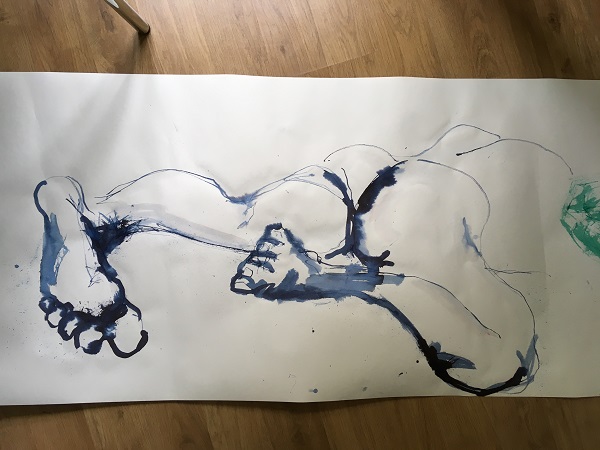
To keep to a budget, and for ease of transportation I have started working on rolls of lining / wallpaper. I absolutely love working this way – it’s like a never ending roll of ideas, and and I find that each drawing – although different – entwines into the next, thus creating a type of accidental narrative. It also reminds me of a ‘mind map’ or length of thought processes of my work so far. The simplicity and knowledge that I have a pretty much un-boundaried roll of paper, means I don’t have the anxieties of limitations or of working on a ‘final piece’ – it can just happen. In fact I totally recommend it to any artist whom suffers with anxiety – as it’s such a fun and unnerving way to work.
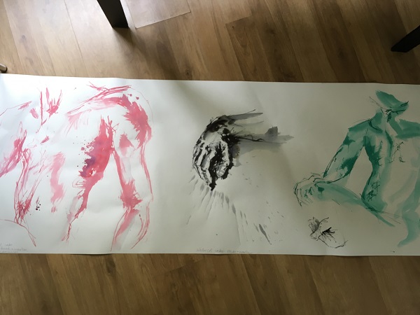
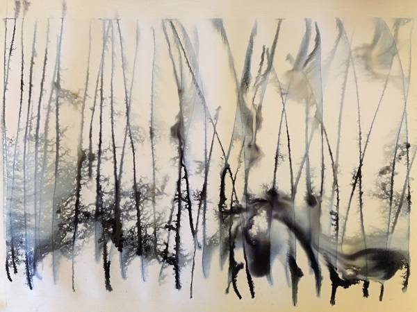
Choosing human form (as my favourite subject), I began to draw with a mixture of inks and washes, and used lots of random different sticks and objects to draw with, which I had got ready by the side of me. Because i was working large, the sticks and brances etc needed to be pretty big too. This really helped as I immediately felt the need to work downwards on the flat floor to work, whilst kneeling or standing and moving around the papers. I found I had a good view of all directions working this way.
These drawings are experimenting with applying ink on paper – rather than scratching through or etching. To validate this, is simply because I really wanted to start off with getting a feel for the larger scale first and using larger scaled items to paint or draw with. It seemed like the next logical step for me and my style of working.
Here are some of my mark making drawings on the roll:
Feeling happier, confident and content with the larger scale and strength of the paper, I then started to try double layered mark making ideas and experimentation…
I had great ideas, but didn’t get very far… After drawing out my replication of a foot on enormous paper, I then realised that I really liked it so much I didn’t want to add to it.
Additionally, the work is sooooo big that it’d be near on impossible to cover and scratch or etch over it. I felt a sinking feeling that I actually needed to reduce the size of my work to complete this layering task. I will reattempt this on A4 or A3.
I also wanted to show the size of the drawing compared to me – it’s big!
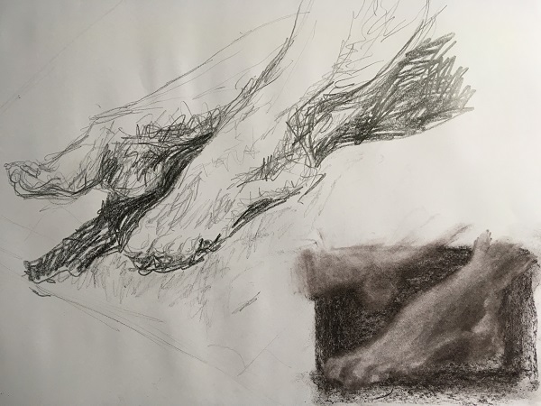
Regarding the piece above, I love the hard lines which smooth into a mist – it makes me think of Charles Maussion’s work, which I had noticed at our local Sainsbury’s Centre of Visual Arts gallery last year. For example, see ‘Back of Nude, oil 1985, see below. Like Maussion, the image seems to appear from the back ground – emerging or disappearing. It’s not quite clear which – but I think that adds to the mystery. It also suggests memories and a feeling of passing time – just like a foggy memory or a haze of movement. Whilst Maussion successfully works on whole figures and in oil, I like to manipulate graphite and charcoal giving similar effects to his way of working, except that I prefer to dislocate the body in parts per image. For me, the feet and hands are significantly more important than the other parts of the body and I feel are often lost in drawings and paintings: they help us communicate, move, gesture and work – so why shouldn’t they be the focus of my art.
Maussion’s ‘Back of Nude’ oil 1985, makes me think about the fine line between past and present, our memories and how they fade, age and time with respect to the human form. These are matters I wish to address in my work too. Interestingly I notice that most of Maussion’s compositions are rather direct and straight forward – the subject is directly in front of the viewer (but appears somewhere in time – almost out of focus). A different type of composition would easily distract from the subject and context.
Research Point: Charles Maussion
There isn’t much information available on Charles Maussion – unless you are fluent in french! I was glad that I purchased the Sainsbury Centre of Visual Arts’s Maussion catalogue last year for just £1. Bargain! It’s packed with beautiful coloured images of his work, and a chronology which shows his development as an artist. It doesn’t discuss his private life, but it says that he worked with other artists such as Mondrian and Malevich in a geometric direction during the early 1950s, and then moved onto lyrical abstraction in the later 50s, where is work was often layered on th esurface with graffiti like marks, or by drawing with a highly calligraphic manner – it is said that he was influenced by Chinese calligraphy. This can be seen in works such as ‘Untitled Sans Titre’ 1958 Gouache, see below. With these pieces there is already a sense of past and present – used by the layering.
Maussion went onto more architectural projects including using mosaics nearer the 60s and into the 70s, and also abstraction. He met Turkish painter Mubin, this is the start of his work becoming a lot more textured. His art titled Relief Sculpture 1972, below, is a good example and I hope illustrates the continuation of his work which emerges or disappears into the background.
Sophie Dupoint, who has researched and undertaken a scholarly study of Maussion’s work states “The adventure of Charles Maussion the artist is, in his own view, a perpetual to-ing and fro-ing, between himself and the work. He knows where to find what is authentic and strives to seek out the most exact correspondence.” (Extract taken from the Maussion SCVA programme).
I believe that this sums up his need to create an image that we can all relate to – a universal feeling of ourselves, and by using the human form and the quandary of time and space, he has achieved this through various stages of his artistic career. Much of his work also reminds me of the relentless moulded back and forths of Giaometti’s sculptures too.
Much of Maussion’s oil work is gentle and soft – with a fleeting glimpse of a figure or two, how ever my pieces are more energetic with mark making – however we both strive to use the basics of the human form to relay our context (keeping it universal by not adding facial details, etc). I will try his slower way of working within the next pieces – but with graphite or charcoal and erasers.
When I compare his work to that of Borreman’s – both use the same ideas of palette / hue, and use this this evoke a desire to be seen feeling – a figure that fades or emerges from the background, like a memory. Borreman uses strong direct themes that could upset, but Maussion’s theme is more discrete and gentle, however, they are both using the human form to suggest human memory, time and thoughts – free from identification.
References:
SCVA Charles Maussion gallery guide book from SCVA shop.
https://artuk.org/discover/artists/maussion-charles-b-1923
https://scva.ac.uk/
Moving back onto the task, I looked at some more mark making, smaller scale with inks and tried to recreate the foot image again on A3. Although I liked the idea of softening my energetic style like Maussion’s pieces, I still wanted a hint of energy. I pondered how best to do this for a few days, and whilst deciding I made some small scale ink and acrylic patterns and mark making (A4 or less). That’s when I decided to make larger versions (A3) and use them as a base, and layer up with graphite or charcoal foot image. The final part would be to use erasers to mark out the highlight areas.
From the piece above I used a graphite block to move shades of grey around the paper. For experimental reasons I used energetic marks in all directions and all sides of the block. I then started to gently outline the foot shape and manipulate the graphite with my fingers and some erasers to create a 3D form. The graphite smudged well, but this made erasing difficult for my hard erasers. The putty rubber worked best, and although it had no sharp edges I felt able to control direction and clarity in areas.
I’m generally happy with the end result – it feels quite ghostly and the idea of the foot just appearing or disappearing from the work is brought about by the gentle soft effects. I’m not happy about the mottled texture – I think this is from a texture underneath the paper when I added the graphite rubbings. Note for future reference to be careful of this! Lastly, I couldn’t resist adding some lines of dynamicness! I controlled the urge to mark all over it and kept to the nearer / bottom edge of the paper instead. I do like the way the erased lines at the top reflect the dark hand drawn ones at the base. Certainly a sign that I am starting to pay more attention to repetition, line and pattern within my work!
Like Maussion, I do enjoy placing the subject matter in a stark and central line of view – it’s uncomplicated and direct. There’s no obtrusive other happenings around the piece – just that part of the body waiting to be found.
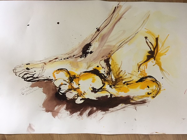
Curious to see if I could try the same effects and pose with a different mood and colour I started again in sunny yellows….
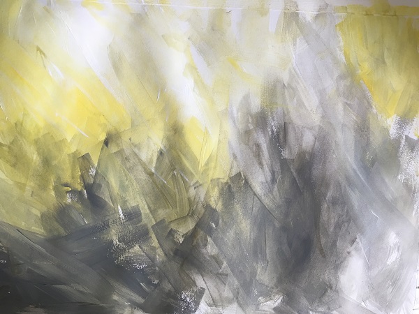
This time I used a selection of yellows, greys and whites to create a slightly brighter mood. Again, I chose darker colours for the closer, frontal areas – which would be the base or ground.
To continue the brighter theme, I used an ochre graphite block, and moved this energetically around the paper, trying not to create actual lines anywhere. I then tried the selection of erasers, and again found the putty one to be the best with this amount of graphite. I worked in pretty much the same way as before, going backwards and forwards, erasing and remarking until I felt happy with the result. Overall I wanted the softness but also the edgy line of sun along the brim of the body – I still wanted this to look like a landscape – the body and it’s place in nature, see below.
I’m good with the outcome – it’s what I worked towards, but then I’m never happy with my work. I’m not sure, despite the relentless to-ing and fro-ing of movements on the paper, I wonder if it has enough back bone. It feel like it’s missing something – I think it might be that it needs even more tonal variation. However I really can’t find a way of pushing this further – without inflicting actual hard lines upon the piece, and this is something I wanted to reduce this time round – for a softer feel.
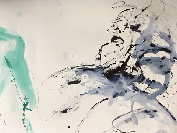
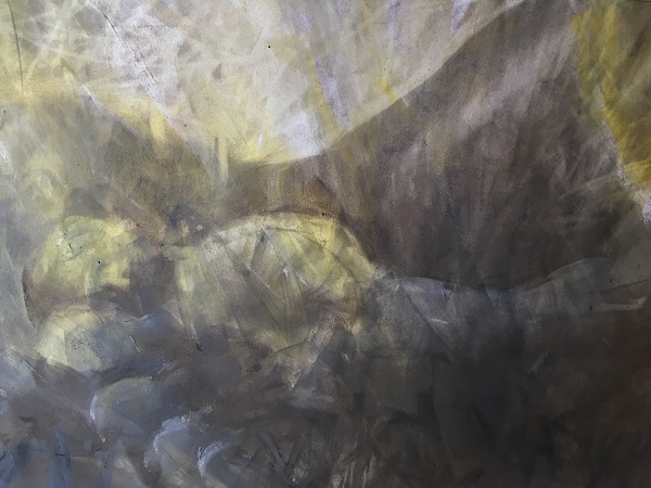
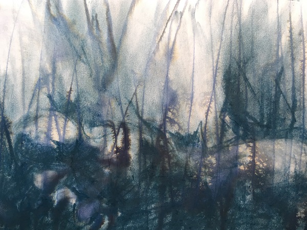
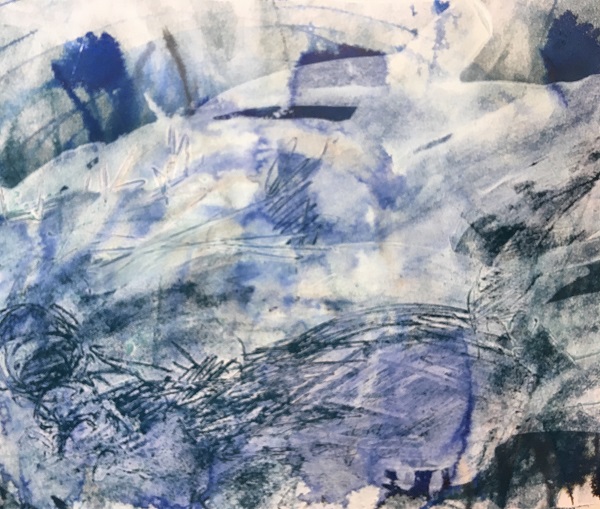
Feeling frustrated a took a break and without being defeated tried again with a completely different background of water and ink marks, see below.
The image above got my enthusiasm back on board, it’s the perfect mix of eerie under growth and dissected scratches that I’m after for my body parts.
To match the already blue tints from the ink, I used my blue graphite block and worked in the same manner as before with erasers, adding and removing areas. I still wanted to retain the soft subtle fleshy skin of the foot and the mist in emerges from , the underneath ink stalks still emerged to give a real sense of depth to the image by providing a foreground. Perhaps this is what was missing from the flatter feel of the previous pieces. Ever a perfectionist, I still feel I need to improve the piece – it’s certainly not a final piece ( and my tutor will chuckle at that I’m sure!) but it’s certainly nearly there. For me, I want more precision in the foot and it’s tonal range. This is something I can work on though and add too. Pic below…
After a couple of day’s break, I came back to the exercise afresh with some new ideas, Briefly, I wanted to try some different products, such as some oil bars and some white ink. I worked in the same method as before, see below:
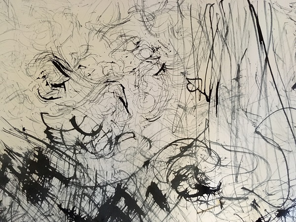
I really enjoyed the mark making above, and will use this practice again for sure! It’s pretty messy but the unexpected line range is wonderful – not to mention the direct link between nature and paper.
Using oil bars in various colours I covered the page and then scrapped the thick substance away to reveal highlighted areas. I was disappointed that the oil bars had actually stained the paper – as I had hoped for some white to shine through, None the less I continued, and enjoyed making a wealth of various marks in different sizes and and directions to fit the subject matter and offer some texture. I enjoyed the whole process, but next time I’d be more careful of coverage and my palette. In this instance it’s such a lively colourful and erratic drawing / etching that it all seems to come together well -but it’s a bit striking and crazy! See below…
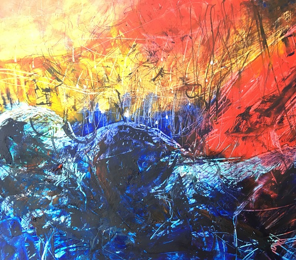
To continue experimenting, I painted white ink over some black ink lines, with the idea of scrapping or etching through the white ink. See below for the beginnings…
I added the white ink (Ecoline 100) with a palette knife in gestures across the image. Unexpectedly the white ink was actually rather overpowering (I’d expected it to be less harsh and a bit more transparent) and it was a bit sticky which made it hard to etch through! I think next time it might be worth watering it down a little first!
Not wanting to be defeated, wiped some of it away – but this only made it dry quicker! I sprayed it with some water and started to etch through it with a stick. It felt like ploughing through snow! Sadly, I didn’t get much time to etch before it had dried – which was a shame as I’d got a selection of different sized sticks ready.
What also took me a long time was the reversal of tones and shadows. Much like lino printing, I had to etch away the shadows – and after spending much time recently erasing highlighted areas this resulted in a brain malfunction! None the less I rapidly did the best I could within the short space of time.
The results were not great – but that’s just a great excuse to experiment more. Once dry, I moved back to graphite – opting for blue to continue the palette theme. I was surprised at how this transformed the whole piece. Suddenly marks which had disappeared within the sticky white ink, emerged and the world felt a happier place.
Of all the pieces, bizarrely my favourite is the last one, above. Along with the abstraction, it carries texture and emotion. I love that it shows my marks in all various forms: the thin watercolour ink base lines, the think palette knife white ink lines, the stick engraved marks of the human form and lastly the gravelly organic graphic areas. But together it gives a feel of near and far. The white ink, which I suspect is oil based (even though I thought it was water based!) creates a type of glaze which muffles the background – creating that soft feel that Maussion carried in his work – only this is less subtle – and thus more modern ‘in your face’ attitude. Dark hues are repeated, and almost look like a sea scape – of which my original intentions are to resemble the human form as landscape, in my eyes – this does that.
Lastly – the crop helps. The image above, is a slight crop on the original which is more landscape. I did the same with the previous oil bar piece too – and feel much happier with the square sizing. I think this is because it’s a person as much as it’s a landscape – so a square seems more apt. It could just be that it’s simply a better composition! I think it does need to be a bigger scale though – but that is something I may continue with further down the line…
OCA Reasearch Point: other artists’ mark making
On researching, I stumbled across this useful link about mark making artists from Tate:
https://www.tate.org.uk/art/student-resource/exam-help/mark-making
Rembrant – I found an ebook for just 99p titled ‘Rembrant van Rijn: 141 Etchings and Drawings, by Narim Bender, which is great visual guide to his images with some annotations by the author and a brief history of the artist. Inside I found this etching, see below, which I particularly liked and felt that it illustrated the range of mark making that Rembrant used well. There’s a mix of fluid wide marks in the sky which suggest space and freedom, which the tight nit detail and finer ink is chosen for the man-made cottages and fences. Detailed dots and lines are also given to the trees and surrounding nature, perhaps he sees these as just as important. Dry brush marks can also be sighted at the base of the image, to offer organic texture. The wash of brown pulls everything together – from the darkest at the base to the surrounding swirls in the sky. Wider and darker lines are used at the base to convey a feeling of proximity. He draws the viewers eyes to a focal point journey to the cottage by leaving this naked on the page.
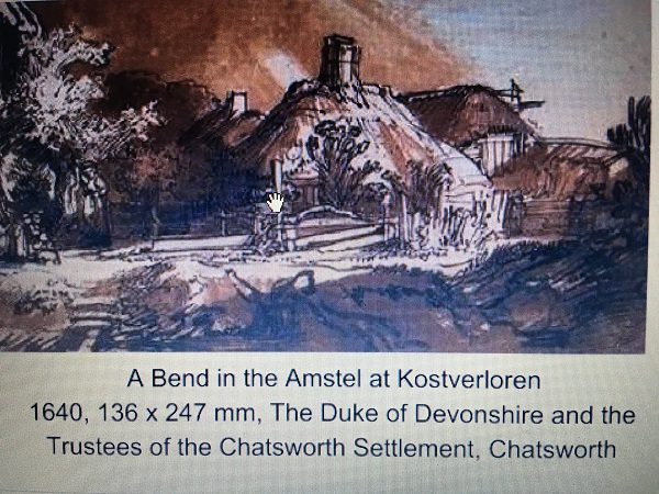
ebook: Rembrant van Rijn: 141 Etchings and Drawings, by Narim Bender,
Author Nadim Bender, explains Rembrant’s upbringing and his association with using printmaking and etching within his art work. It becomes quite clear how his love of line and mark making became so apparent with that in mind. I found this quote by the author useful: “As always, Rembrant drew only what was essential. His animated line moved vigorously along the sheet, creating varied and rich effects of texture and surface.”
Caravaggio’s work is known for the tenebrism or chiaroscuro technique he used, which used shadow to emphasise lighter areas. His mark making can be seen in the image below, where he uses pen and brown india ink and black chalk on brown paper. Both artists, Caravaggio and Rembrant, have used a very limited palette to create stunning pieces of work, via layering and texturing.
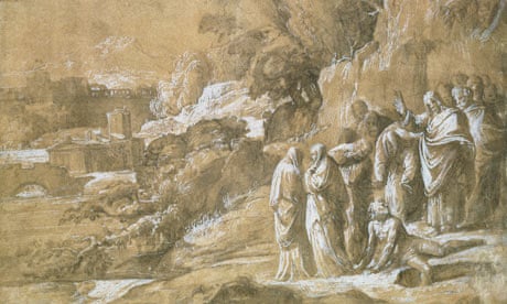
On close inspection , this work is much tighter than that of Rembrant’s or even of my own style. However it lays the same creation of matter through a network of lines and dots. Whilst I’m not personally into tight work, its wonderful to see the variation of marks and colours together. The colours and choice of materials almost look sculptural or carved – perhaps to promote the strength and durability of the narrative.
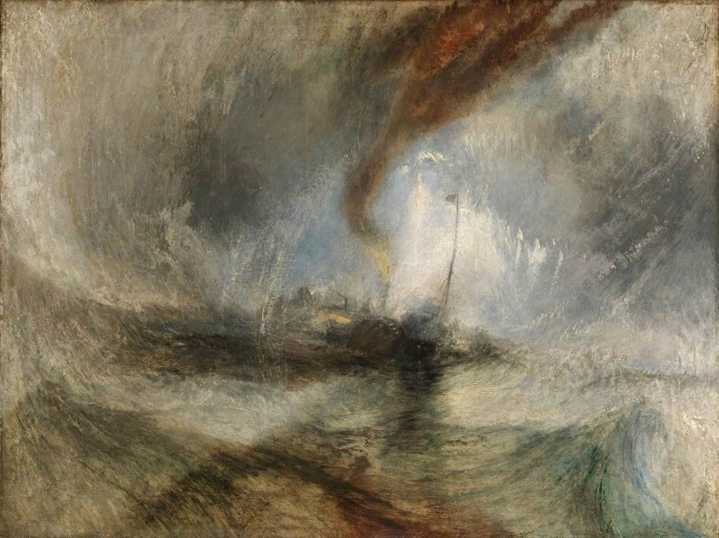
Joseph Mallord William Turner is a big name artist, with work spanning over sixty years – who hasn’t heard of him?! This is why I’m a little apprehensive of his work, as personally, I like to find out about the lesser known artists as I feel that these people are just as important to know about – if not more. But that’s just a personal thing – which clearly I need to get over!
Turner’s work is incredibly moody – especially the seascape pieces, for example see below. I love the movement, textures and repeated lines which, when all combined offer real drama – and he does this through painting the weather conditions more than the land The movement and the blur effect on the central focal point adds to drama and also makes me think of memory too – especially when I associate this with Maussion’s pieces which have the ability to appear and disappear from the mist. Both artists, do not add identity but do add great detail into the important factors here – the danger (the storm) and the appearance of life ( the boat and the light). It’s a real battle between nature and human power.
This painting, much like his others, was created in oil paints – however looking at it online, the definition and textures made me think of conte or pastel – there’s so many layers, energy and lines here. Perhaps these materials are something I should consider using with my work. Turner is often known as the ‘painter of light – due to his ability to paint luminous colours and powerful atmospheres.
On researching Turner online, it is believed that John Robert Cozens, a fellow English romantic painter, had a lasting influence on Turner by his use of water colours to create his luminous atmospheres. I can see this in Cozen’s work, for example the atmospheric ‘Lake of Albano and Castel Gandolfo at sunset’ 1777, see below, and Turner’s ‘Fishermen at Sea’ 1796, see also below..
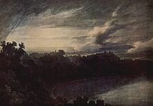
https://en.wikipedia.org/wiki/John_Robert_Cozens
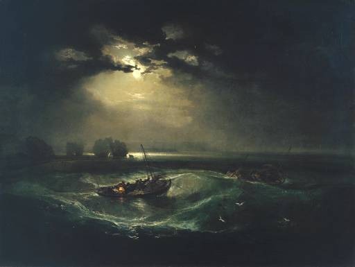
https://www.artble.com/artists/joseph_mallord_william_turner/paintings/fishermen_at_sea ge from:
On looking at his work online, it is interesting to see that he moved from very detailed and tight early pieces inspired by Dutch Golden Age to a more looser, energetic style in his later years which also explored his imagination of the sea. Most of these pieces can be viewed online (see list below), but it gives me an incentive to whilst being sure about the structure of what I’m drawing – it’s also ok to be inventive and imaginative. I also take away with me that central composition he used so much – usually with swirling skies or movement around the lighter focal point – almost dream like.
Visit / references:
Learning to Look at Paintings by Mary Acton
https://www.artsy.net/article/artsy-editorial-jmw-turner-britains-great-painter-tempestuous-seas
https://www.artble.com/artists/joseph_mallord_william_turner
https://en.wikipedia.org/wiki/John_Robert_Cozens
OCA Research Point: Jereme Crow
Next, I looked at the work of Jereme Crow, as suggested in the OCA coursework. Saatchi Art website describe Crow’s paintings as “concerned with exploring biography/portraiture, repetition, temporality, time and memories through the manipulation and invention of narrative”. On looking at a selection of his work, I would strongly agree with this, and see a link with Jim Shaw’s work ( which I researched a few paragraphs ago). Both draw inspiration from art, social attitudes and culture around them and combine classic and modern attitudes to make statement pieces. From Crowe’s own website he’s quoted as saying ” I am interested in the way other artists paint, particularly artists from the past. Looking at artists such as Van Dyck’s work in the Portland Collection, I admire how he used meticulous glazes for the faces and perfectly rendered fabric and clothing. My most recent paintings draw from historic works as well as the people I meet today.” This is particularly evident in many of his pieces, including the one below, see below with caption.
I’m not sure how my work links with Crowe’s – or vice versa as his work is much more painterly – being a painter. I guess we both enjoy swift brushstrokes and I do enjoy his ideas and art techniques.
References:
http://www.lilfordgallery.com/folkestone/jereme-crow/
https://www.oca.ac.uk/profile/jereme-crow/
https://crowfineart.com/
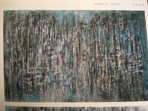
Own choice of researched artist: Diana Al-Hadid
I noticed Diana Al-Hadid’s peices in ‘Vitamin D2 New Perspectives in Painting’ as her work is very energetic and looks to be built up in layers, see example below.
On careful inspection, its almost like a photographic negative etched over a wood grained paint, which also look like streaming rain against a window. The colours are dull and ghostly – there’s a real feeling of disaster or gloom, but also an anxiety of what’s about to happen – I will find out if I look closer, but then I am part of the knowledge of that picture. Much like Borreman’s work which makes the audience witness to the evil, Hadid’s style works the same way by pulling the viewer in from shear curiosity.
I like that layers can do this – partially hide or reveal what the artist wants the audience to see. It’s rather controlling and manipulative, by it’s also the audience’s choice to get involved, so I don’t feel guilty.
Al-Hadid’s drawings often run alongside her similar looking sculptures and installations- her choice of materials in her paintings reflect the 3D robost nature – and like her sculptures they’re built up of layers of either added products or erased ones. These offer a sense of 3D with semi-transparent lines, creating a feeling of floating timelessness. This works well with the gloomy colours and, as a viewer, I feel part of a memory or a discovery from the past.
Al-Hadid’s inspiration comes from Western and Islamic civilisations and can be seen in as architectural references in her work, but the whole ghostly feel presents questions about their present and future – are they ruins or are they ideas of the future.
Much like Borreman’s work, she works with a particular pallette and manipulates that colour to expose it’s all. The vertical lines, almost pattern like make me think of Eames’s pieces – the sequencing and voids between there and now – it’s comforting to know that there is that reliable sequence and time I can relate to amid the ghostly chaos emerging beneath it. This is the finer detail am working towards within my work – the building up of time, strength and memories within the layers.
Overview of Project 2
I’ve been researching a lot in this unit of work – perhaps too much, and it’s a ll been a little overwhelming. Before, this ( at the start of the unit) I felt I had clear ideas of what I wanted to do, but following the thoughts and inspirations of researched other artists, they are very much on my mind and I’m not sure if they are actually distracting or helpful…. Certainly the amount of research has been very time consuming and lengthy, making me feel too tired to paint or draw. That being the case I have found that taking lots of breaks has helped, but has resulted in the work taking longer generally.
Project 3: Narrative
Create a narrative with materials and certain ways to apply them, without using words. For example, thick plastered encaustic materials or fine dusty chalky surfaces both tell different stories, moods and information via it’s associations and appearance.
The OCA have given a method of of thinking of someone whom I have strong feelings for, and selecting an object or item of clothing of theirs. Using this, create a piece of art that gives the viewer a sense of that person.
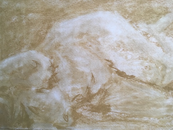
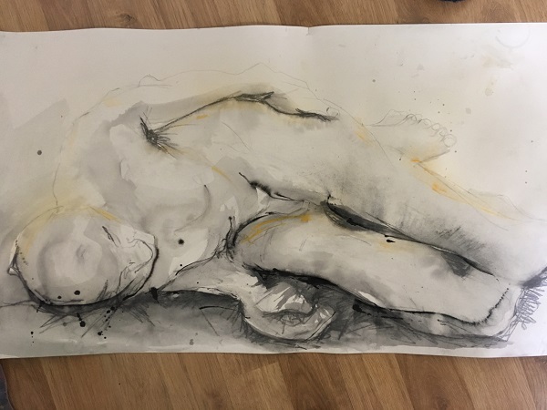
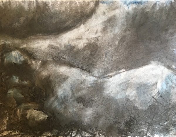
Immediately, I find myself thinking back to my drawings in Part 1, of the loose bracelet and arm on the life drawing. This was made with soft pastels and graphites, which ooze the gentle nature of the person. The composition I chose was rather different however, offering thoughts of complexity as the arm was enclosed with the torso and created an almost landscape feel, see below.
I think this worked quite well, so I will set out to do this idea again….
Thinking of other ideas, I collected some eggs from our chicken and placed them in their box. I always think of this half dozen as a family unit for some reason. Taking this further, I drew a face on each one to create a feeling of personal identity and to try and evoke some feeling and narrative to who ever came to use them, see image below.
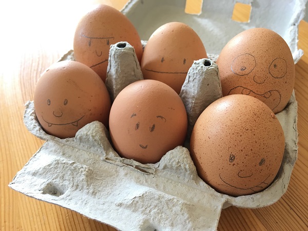
Sure enough the next day was the weekend and we usually have poached egg on toast. Our eldest teenage daughter opened the box and squeals of laughter came wafting through the house. She thought it was hilarious and couldn’t wait to use them. Typical teenager, thinking of self and non serious side of things…. However, our youngest actually quickly became very attached, bonded and defensive towards using them for breakfast. He wanted to keep them as his pets, called them cute and wanted to play with them.
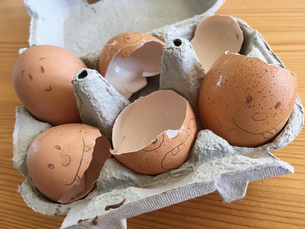
I hadn’t taken the eggs out of their natural expected environment, but just the mere addition to their appearance had rendered them from food to ‘pets’. I wondered if this would be the case if I were to draw pigs on our bacon rashers!
I started thinking about making a feathered egg, or a metal soft toy. I even thought about filing and holding a funeral for a coffin full of child’s toys to represent innocence lost, or putting our old age hen in a tin in the hope of ‘capturing’ death. But, after rereading the brief I realised that I was supposed to draw the ideas instead. I spent a few days thinking and dreading about what to draw (I’m not a fan of still life), and finally decided on one of my daughter’s special and first soft toys. It’s a soft whitish bear called Snowy. It’s one that she doesn’t ‘need’ anymore, and I guess I’m more emotionally attached to it than she is, as I have fond memories of her always with it when she was younger,
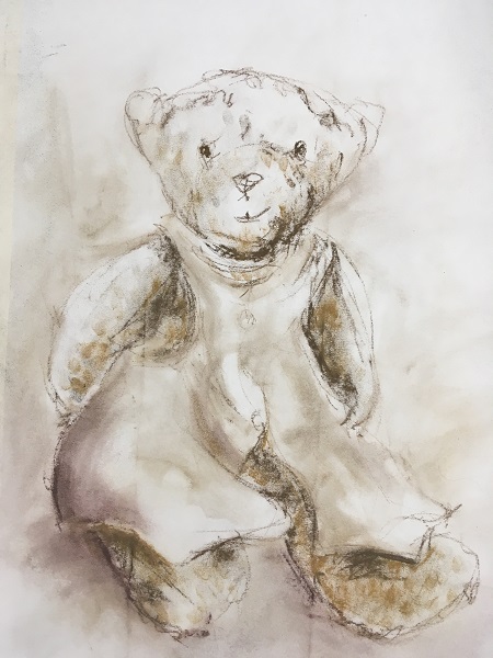
When drawing Snowy, above, I tried to capture an old sepia effect with the colours, almost like an old photograph. To support this, I tried a straight on composition, no frills, but like Maussion, I wanted to concentrate on the subject first and foremost. I did consider trying a pose where the soft bear is looking out from a box with a lid, with the narrative of ‘once loved’, but thought this would be too obvious.
I used soft ochre coloured graphite to try and show the softness – I particularly enjoyed using my finger tips with this as it adds a personal, direct touch too.
Sadly, as I worked on the floor, I should have put something under my paper as the lines from the floorboards came through! I had thought that the paper was thick enough to with stand it.
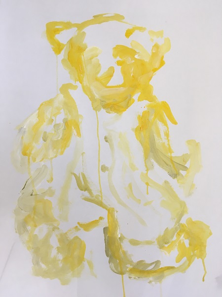
For my second version of Snowy, above, I wanted to illustrate the human growing up. The looseness and painted dribbles are to indicate almost a child’s version with innocent lines – bold and structural and yet not strong enough to control tone and depth. I wanted to keep the colours similar to the sepia tones, but raise the brightness to a fun child’s colour of yellow.
This time I worked against a wall, and this created some dribbles of paint, which I loved and encouraged. IT added to the feel of a kid’s creation, but also looked like the bear was crying – perhaps for loss of love as the child grows up and has new interests.
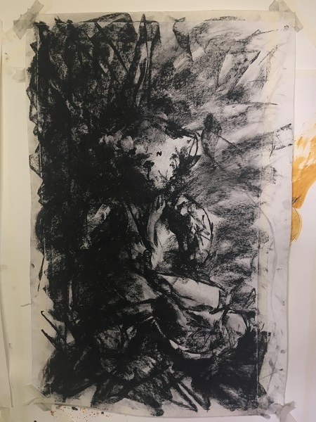
As the child turns to adolescence, the bear is lost at the back of the cupboard or shelf. A dark, shadowy area where all colours are lost. The glint of white bear is just recognisable, amongst the busy life of a teenager – I wanted to create a dynamic, crazy and dark area for this bear to be found in. Using charcoal I scribbled hard with sharp lines, and so realised how much dark black I could produce. The bear really is hard to find within the mess of black – but that’s exactly what I wanted to create.
Interestingly, I could attempt to make an image that contains all three aspects of time, but I will leave this here now, as I wish to move on – I’m surprised that I’ve lasted three drawings of still life – using narrative made it much more interesting for me!
Contextual Focus Point: Cornelia Parker
At first look, unresearched, Cornelia Parker’s 2010 ‘Poison and Antidote Drawing’ makes me think of several things. Firstly, it makes me think of several things – that’s good – it has narrative. It’s rather scaled back with regards to colour, form and application; so it’s likely to appeal to a variety of audience as it has no boundaries.
I appreciate the beauty of nature’s own course of basic man-made items within this piece: the black ink, folded as a child would create ( and something we can all relate to), to form a natural pattern on man-man white paper. The technique and materials are all primary, and yet the result is a complicated and beautiful celebration of nature’s way. A stylised moth or even the elements of a skull can be deciphered from the resulting ink marks – but it’s seen as accidental and timeless despite the human input.
From the idea that it could be a skull, makes the colour choice interesting as it has social and cultural connotations. But the beauty is really how the viewer personally perceives the art.
I find the title interesting, as it suggests a theme and direction that the artist wishes the piece to be seen. I think it’s a shame actually, as the mark making itself is more imaginative on it’s own. However, ‘Poison and Ancidote’ creates a feeling of division, of two sides, of good and bad, and of black and white. Once this title is added, I look at the piece more as a dark blood stain, or of something more sinister, of life or death. Perhaps the paper is seen by the artist as a sheet of life with the poison being the ink or cancer that infects and crawls across it – soaking up it’s heavenly white purity. There appears to be a similar balance of white and black – suggesting a balance or harmony of two.
On researching the piece further, the title makes more sense when I find out that Parker has used actual rattlesnake venom and black ink, anti-venom and white ink to create her pieces. This makes me appreciate the pieces more – with regards to the ideas, effort and difficulties that sourcing these substances must have taken. However, sadly these substances are not apparent on first inspections of the piece, so this adds another dimension to the art work – and I see why Parker uses the title given. I do question the need to use such unusual substances, when they are not apparent as to what they are without the need for an added title.
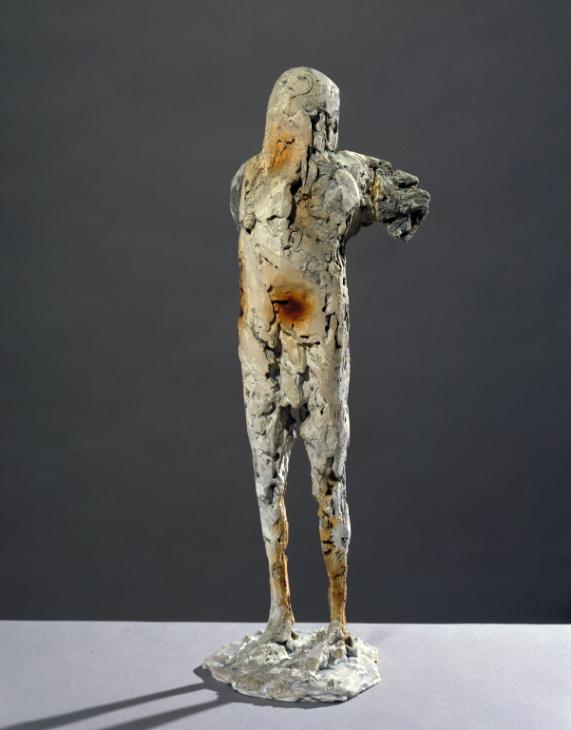
Many artists use actual materials of their subject within their art, for example, Elizabeth Frink sculpture of ‘Bird Man’ uses wood pressed into the plaster to leave an imprint. This becomes a pure identifiable imprint, and represents originality of the wooden wings used by the Frenchman Leo Valentin’s doomed attempts to fly. It also adds to his own embedded belief that the wooden wings would make him fly. It’s a clear connection and makes more of an understandable relationship with the artist and the audience. Adding actual parts of the subject matter gives a real feeling of history – almost like a time capsule. It gives a sense of going the ‘extra mile’ to create and represent that moment in time. Additionally it adds another dimension to the art work, either via our senses – such as Olfactory art, or by added information or concepts. When compared to paintings without subject matter, to me, there’s a loss of narrative and body of work, however adding these elements practically can be challenging.
On further ponderings of this though, I wonder if Parker can use the fact that poison can be undetectable around us, This then offers yet another element to her piece. A piece, which on first reflection comes across as an innocent child’s folded print, can actually be a sophisticated network of narratives, making it very exciting to me.
Parts and imprints of wood add to the artist’s commitment to representing Leo Valentin’s doomed attempts to and fly using wooden wings.
There are also various versions of Parker’s venom and anti-venom drawings made spanning over several years. A curator on The British Museum’s website (
https://www.britishmuseum.org/research/collection_online/collection_object_details.aspx?objectId=691360&partId=1&school=13279&page=5 ) states that Parker describes the process of making the drawings as follows: ‘In the ‘Poison’ and ‘Antidote’ drawings (nb ‘Antidote’ drawing 2000-5-20-11), which is a series of linked pairs, I began with the idea of different sorts of Oppositional things”. She continues by talking about “The idea of poison appealed to me when I thought of someone literally dropping dead on reading a ‘poisoned’ letter… Mixing snake venom and ink had a lot of resonance for me and using Rorschach blots was significant as I could not fully dictate the result”. Rorschach blots are psychological tests in which subjects’ perceptions of inkblots are recorded and analysed using psychological interpretations. Psychologists often use this technique to examine a person’s personality and emotional functioning, so this gives Parker’s art yet another aspect, that is much more personal and organic. Control and power are often identified psychological behaviours, so I find this an interesting relationship with the lack of control in how the inks move and soak through the papers.
I originally thought these pieces were monochrome, however on closer inspection I believe they are a selection of hues. The British Museum curator’s quote from Parker explains that she uses Quink inks. I use these two and have noticed that the black breaks into a flurry of other hues when water is added. This is hard to control, so I return to the natural course of nature which surrounds these drawings and prints.
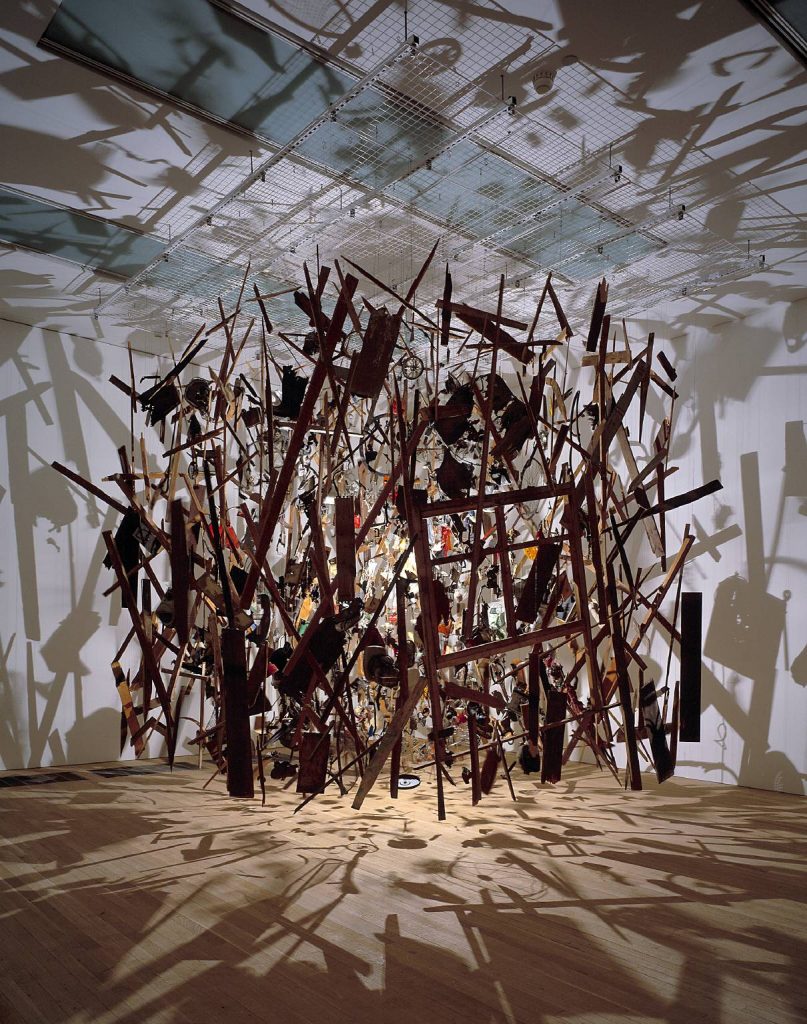
I would love to see these pieces in real life, as I don’t feel the computer screen light and size best gives off the real characteristics at all.It looks like the Tate has a version on display, so I will check it out next time I’m in London. I have been lucky enough to have seen her past artwork ‘Cold Dark Matter: An Exploded View’ about a decade ago at the Tate’. I remember feeling massively impressed by the strategic construction of this 3D freeze framed combusted shed and the shadows it created, however at the time I was not looking at art the same way that I am now. It is however, a piece that I will always remember – it had real impact, which I don’t believe that the internet or printed versions achieve.
When I compare both pieces of art, both appear dynamically different on presentation, however they both share the same in depth detail and complexities. Briefly, Cold Dark Matter displays as a large stand alone piece whereas, Poison and Antidote are singles of a huge body of work.
To add, I’m not sure if the ‘Poison and Antidote Drawing’ pieces need to be shown as a series, as they work well as a stand alone piece. It is like a collection or body of work, with no actual one final piece. I can relate to this practice, as I work in a similar way, building up several pieces and accepting that each piece is just as important as each other.
From Parker’s work, I’m inspired by the use of subject matter used to help create the narrative, but also the simple idea – which can become as complex as the artist wishes to make it.
Visit / references:
https://www.britishmuseum.org/research/collection_online/collection_object_details.aspx?objectId=691360&partId=1&school=13279&page=5
https://www.tate.org.uk/art/artworks/frink-bird-man-t07417
https://www.tate.org.uk/art/artworks/parker-cold-dark-matter-an-exploded-view-t06949
https://www.tate.org.uk/art/artworks/parker-cold-dark-matter-an-exploded-view-t06949/story-cold-dark-matter
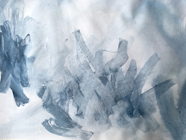
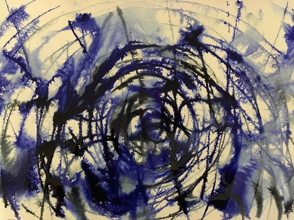
Some of Parker’s work has inspired me to use more natural tools and elements to my work, see below piece. I used masking fluid to draw the outline of my feet, then saturated the paper in inks and left it outside over night in the rain. I really like the water puddles and patterns left naturally by the rain, it’s very striking against the more ‘man made’ lines of my feet. I feel that more layers are needed though – it feels a bit one dimensional at the moment. I will continue this in my PP work, as it suits the work on ‘Boundaries’…
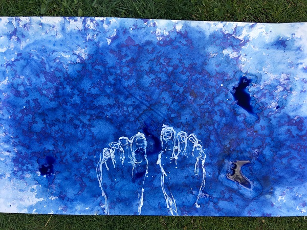
I knew what context I wanted to achieve, the battle of organics, but I had to experiment with products and mark making techniques for the right outcome. I wanted to use nature as much as possible, so after creating the basic structure of human feet with masking fluid, battered the paper with inks and rubbed it hard against the grassy ground. I then left the work outside in the night-time rain and the above image is the end result.
The clogs of water have naturally created zones of colour, which offer a mottled organic 3D effect – but it’s very subtle as the blue is very overpowering. There’s hardly any white paper left over – apart from the masking fluid which has preserved the outline of the feet – and these feel too heavy against the background. I guess, in it’s current state, the image tells a story of our clumsy human ways against the gentle path of nature. However – there needs to be more to this work – it’s too bare / not enough at the moment – it needs a spine. I will continue this work within my PP – as it is now bordering on ‘Boundaries’ which is what I’m thinking of doing for it. Please see my PP pages.